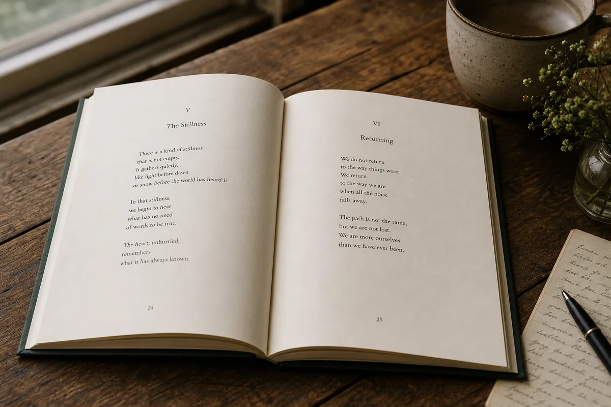
Formatting a poetry book requires left-aligning stanzas to form a unified visual block, using exact paragraph styles with controlled vertical spacing instead of blank lines, disabling hyphenation to prevent word breaks, and setting generous margins of 0.75 to 1.0 inch to isolate poems in whitespace.
Unlike novels, poetry relies heavily on page layout, stanza breaks, and negative space to set the reading rhythm. Amateur poetry layout often collapses in print because formatters attempt to use standard novel settings.
In this guide, we explain how to preserve line breaks, handle stanza spacing, select trim sizes and elegant fonts, and manage page numbering. Before formatting, read our standard book trim sizes guide to choose your target size, then calculate your exact spine width once your interior page layout is finalized. Ensure your final file complies with print-ready PDF requirements and compare Word versus InDesign formatting workflows to see how design quality affects poetry collection design.
How to Preserve Line Breaks
Poetry relies on exact line breaks to dictate the reading rhythm. When formatting, never use manual spacebars or tabs to position lines. In Word, use soft returns (Shift+Enter) to end a line within a stanza, ensuring that if the screen or page size changes, the line behaves as a single block. In professional software like InDesign, disable hyphenation globally for poem text to prevent words from breaking awkwardly at the end of lines.
How to Handle Stanza Spacing
Stanza spacing should be set using paragraph styles, not by hitting Enter to create empty lines. In your layout software, create a paragraph style for your poem body and adjust the "Space After" value (typically 6pt to 12pt). This ensures that stanza breaks remain consistent throughout the book and don't disappear during eBook conversion.
Best Trim Sizes for Poetry
Poetry collections feel more intimate and print best in smaller trim sizes. The most common sizes are:
- 5 x 8 inches: The classic chapbook format.
- 5.5 x 8.5 inches: Standard trade paperback size, perfect for contemporary collections.
- 6 x 9 inches: Best reserved for poetry collections that include long-form prose introduction or commentary.
Read our guide on standard book trim sizes for more size options.
Best Fonts for Poetry
A classical, elegant serif typeface is the standard for poetry. Avoid loud or distracting fonts that pull focus away from the words. Recommended choices include:
- Adobe Garamond Pro: Clean, elegant, and highly readable.
- Baskerville: Slightly more formal and crisp.
- Cormorant Garamond: Perfect for contemporary or minimalist layouts.
Review our detailed guide on the best fonts for books to select the perfect font for your style.
Page Numbering for Poetry Books
Page numbers in poetry books should be placed unobtrusively, typically in the footer or centered at the bottom of the page. Many poetry books hide page numbers on the first page of a poem or on blank divider pages. Running headers (the author name or collection title) should alternate on left and right pages, but should never appear on blank pages.
Print vs. EBook Poetry Formatting
Print layouts lock every poem to an exact page coordinates. eBooks, however, reflow text based on screen size, which can break long lines of poetry and create awkward wraps. For poetry eBooks, you must either simplify the layout for a reflowable EPUB or build a fixed-layout eBook to ensure that lines do not wrap and split stanzas across screens.
Visual Comparison: Poor vs. Professional Layout
Compare the differences between amateur and professional layouts:
- Poor Poetry Layout (DIY):
- Centered lines without alignment structure, making it hard to track line transitions.
- Single spacing without stanza breaks (empty lines that get stripped out).
- Default Arial or Times New Roman, giving it a raw manuscript feel.
- Stanzas splitting awkwardly across page breaks.
- Professional Poetry Layout (DesignDile):
- Left-aligned lines grouped around a consistent visual center block.
- Controlled paragraph spacing between stanzas (using "Space After" styling).
- Premium serif typography (like Garamond or Sabon) with generous line heights (1.4x).
- Page breaks set to ensure a poem starts and ends on a single spread where possible.
The Takeaway
Stanza layout and white space require precise control. If you want us to format your poetry collection, explore our interior formatting services or contact us to discuss your collection.
Frequently Asked Questions
Sources & Technical References
Related reading

Typography & Layout
The Best Fonts for Printed Books: 2026 Guide to Serif vs Sans Serif Typography
11 min read

Typography & Layout
30 Best Google Fonts for Book Design & Typography
15 min read

Typography & Layout
Microsoft Word vs InDesign for Book Formatting (2026): Can Word Really Compete?
11 min read
Explore our poetry & literary formatting, read best fonts for books, see portfolio, or view transparent pricing.