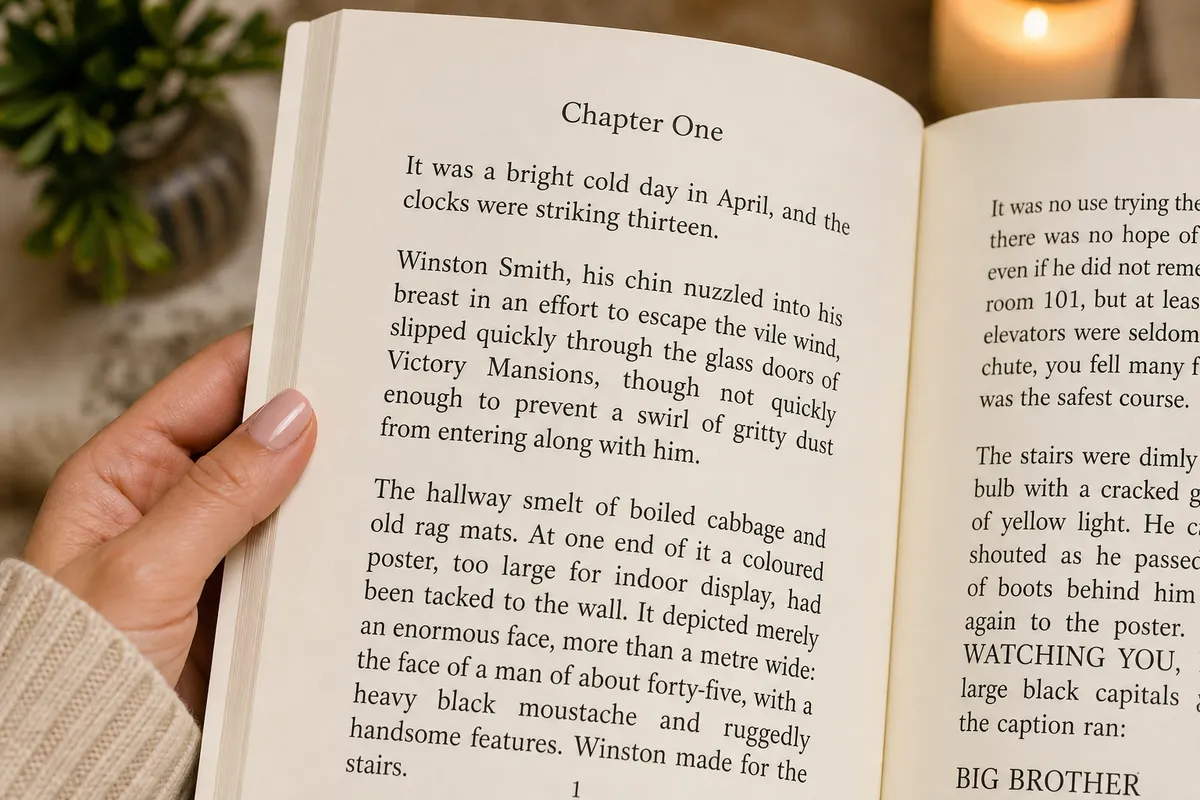
Large print book formatting requires a minimum body text font size of 16 points, generous line spacing (leading) of 1.2x to 1.4x, a maximum line length of 60 characters to ensure readability, and wide outer and gutter margins to prevent text from being swallowed by the binding.
Providing an accessible edition of your book is key to reaching visually impaired and senior readers in the USA and UK. Rather than making a quick adjustment to your standard interior file, a professional large print edition requires a complete redesign.
In this guide, we map KDP quality standards, list recommended layout settings, and detail the page count and cost implications. Before formatting, read our standard book trim sizes guide to choose your target size, then calculate your exact spine width once your interior page layout is finalized. Ensure your final file complies with print-ready PDF requirements and compare Word versus InDesign formatting workflows to see how design quality affects your large print layout.
Who Buys Large Print Books?
Large print editions are not just for a niche group of readers. They serve a rapidly growing market:
- Visually Impaired Readers: Those with macular degeneration, cataracts, or diabetic retinopathy who rely on larger, high-contrast type.
- Aging Demographics: Baby boomers in the USA and UK who experience natural age-related vision changes (presbyopia) and prefer larger text for comfort.
- Libraries and Senior Care Centers: Libraries allocate specific budgets to acquire large print catalogs. Without a large print edition, you miss out on these institutional sales.
- Fatigue-Prone Readers: Anyone who suffers from eye strain during long reading sessions, especially in low-light environments.
By offering a dedicated large print edition, you expand your reach to millions of avid readers who otherwise might not be able to enjoy your book.
KDP Large Print Formatting Requirements
To list your book as a large print edition on Amazon, you must meet KDP's strict quality guidelines. Key requirements include:
- Minimum 16pt font size for the body text.
- High-contrast typography (black text on white or cream paper; avoid light gray or low-contrast colors).
- Maximum 60 characters per line to ensure comfortable tracking without losing place.
- Adequate margins to prevent text from falling into the gutter or off the page edge.
KDP audits these files, and failing to meet the 16pt minimum can result in your edition being flagged or rejected. Compare standard novel economics in our trim size and cost guide.
Recommended Settings for Large Print Layouts
Formatting for accessibility requires adjusting several design parameters. Below is the reference table of recommended specifications:
Layout Element | Recommended Large Print Setting | Purpose |
|---|---|---|
Body Font Size | 16–18 pt | Meets KDP/IngramSpark standards for readability |
Leading (Line Spacing) | 1.2–1.4x font size (e.g., 20–24 pt) | Prevents lines from blurring together |
Trim Size | 6 x 9" or larger | Accommodates large text without causing page count to explode |
Page Margins | 0.75" minimum outer; gutter based on page count | Ensures text is readable and doesn't get lost in the spine |
Line Length | 50–60 characters maximum | Reduces eye strain and helps readers transition to the next line |
Selecting the right typeface is equally critical. For best results, use clean, readable faces like Literata or Georgia. See our guide on the best fonts for books for detail on licensing and embedding.
How Large Print Affects Page Count and Printing Costs
A major design challenge of large print is the page count explosion:
- A standard 80,000-word novel formatted at 11pt with 1.15x spacing might run 280 pages.
- The same manuscript formatted at 16pt with 1.35x spacing will easily exceed 450 pages.
This page count increase has two critical impacts: first, the printing cost per copy will rise, meaning you must set a higher retail price to maintain your royalty margin. Second, the spine width will increase significantly. You must recalculate your cover layout based on the final page count. Use our spine calculator guide to get accurate dimensions before designing the cover.
Accessibility and Readability: More Than Just Big Text
True accessibility means looking at the page holistically. Avoid justifying text with tight hyphenation, as this creates "rivers" of white space that disrupt reading flow. We recommend left-aligning (ragged right) text if justification looks uneven. Keep headers and page numbers clear and distinct from the main body, using a minimum of 12pt for running heads.
Always publish large print as a separate paperback edition with its own unique ISBN from Bowker. Label the cover clearly as "Large Print Edition" so buyers do not order the wrong format by mistake. Submit a dedicated print-ready PDF to ensure pristine rendering.
The Takeaway
Large print is a high-demand edition for a growing audience. If you want to ensure your book passes KDP audits and looks professional, explore our KDP formatting services and interior formatting services. Have questions? Contact us today to plan your accessible book layout.
Frequently Asked Questions
Sources & Technical References
Related reading

KDP Formatting
How to Choose the Perfect Book Trim Size: 2026 KDP & IngramSpark Guide
12 min read

KDP Formatting
How to Format a Book for KDP (2026): Step-by-Step Margins, Fonts & Print-Ready PDF Guide
16 min read
KDP Formatting
KDP Formatting Guide 2026: Advanced Spine Width Calculations, PDF/X-1a Export Specs & Troubleshooting
15 min read
Explore our accessible interior formatting, read trim sizes for KDP, see portfolio, or view transparent pricing.